Company
Hewlett-Packard
Role
Interaction Designer and Researcher
Teams
UX, Product, Engineering
Tools
Adobe XD, UserTesting.com, Excel
Timeline
4 months
Background
Historically, the desktop version of the HP Smart App lagged behind its mobile counterpart due to a "mobile-first" development strategy.
Recognizing the significant number of legacy users still on desktop, our team lead and I aimed to enhance the desktop setup experience to improve user satisfaction and engagement.
Goals and Impact
Goals
Usability: Streamline the setup process for ease of use.
Consistency: Ensure uniformity across the user interface.
Voice & Tone: Align messaging with user expectations.
Impacts
Microsoft app store ratings increased from 2.8 to 4.4 stars.
Improvement in all ux metrics: confidence, ease of use, and visual appeal and NASA TLX workload.


Process
Path to a more scalable, compelling website
01
Expert Evaluation
Creating a user journey
02
Prioritization workshop
Aligning with stakeholders
03
baseline study
Gathering baseline UX metrics
04
Design + Iteration
competitive analysis, Design, internal reviews
05
Delta Study + impact evaluation
Success Evaluation
Impact
Microsoft app store ratings increased from 2.8 to 4.4 stars.
Improvement in all ux metrics: confidence, ease of use, and visual appeal and NASA TLX workload.
01
Evaluation
02
prioritization
03
Baseline
04
design iteration
05
impact
Expert Evaluation
Journey mapping to identify hero moments and pain points
We began by mapping the user journey to identify key moments and pain points. This evaluation provided a comprehensive understanding of the user's experience and highlighted areas for improvement.

01
Evaluation
02
prioritization
03
Baseline
04
design iteration
05
impact
Prioritization Workshop
Aligning within the organization
Approach
Collaborating with stakeholders, we conducted workshops to pinpoint and prioritize issues. This collaborative approach ensured alignment and informed the redesign process.
Goals + Rationales
Leverage our tribal knowledge of known customer problems to help inform the redesign
Create stakeholder buy-in for backlog prioritization

01
Evaluation
02
prioritization
03
Baseline
04
design iteration
05
impact
Baseline Study
Measuring the current experience
Objective
To establish a baseline, we conducted qualitative sessions in the San Diego office, focusing on the end-to-end setup flow. This study provided valuable insights into user frustrations and validated our journey map.
Approach
Conducted qualitative sessions in the San Diego office
Targeted end-to-end setup flow: from initial instructions to first print
Developed and used a discussion guide and embedded micro-surveys

Methods
Paused users at key journey points to capture immediate feedback
Collected both qualitative insights and ratings of ux metrics (time, confidence, ease of use, number of steps, success)

Outcomes
Clearer understanding of user frustrations
Validation of journey map pain points
Actionable input for redesign prioritization
01
Evaluation
02
prioritization
03
Baseline
04
design iteration
05
impact
Install Driver Redesign
One piece of the redesign
Overview
A critical component of the redesign was the driver installation process. Through collaboration with development teams, we enabled background downloading of drivers, reducing user intervention. This change decreased setup time and minimized user fatigue.
Preceding Steps
As a part of the design process, I looked at where users are coming from in the journey to see if there’s anything that could impact the experience once they get to the driver. In this case the copy in the loading screen preceding the driver was misleading, and we addressed this in the design updates.

Backend Work
First we discussed with development if the driver could be downloaded in the background automatically for the user.
Negotiation led to this actually be the hero case with the instruction screen only accounting for ~30% of users. That meant that this was one less step in the set up journey that required action from users, reducing overall fatigue.

Defining Scope
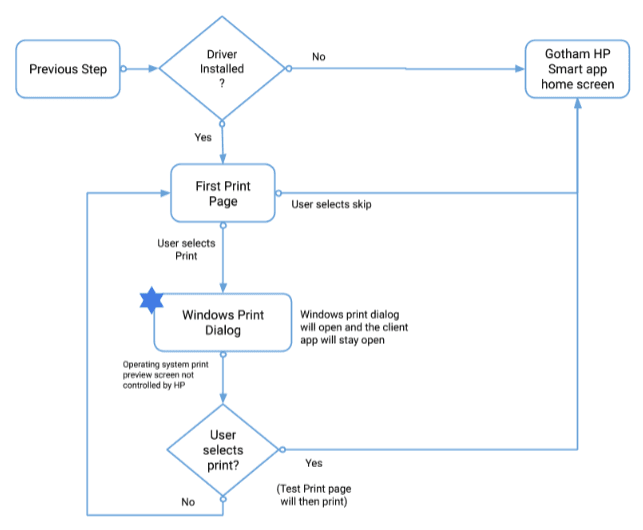
There are two types of driver installations that occur in OOBE. The scope of this deliverable was only for the Manual Driver Install Case.
Auto-matic Install
During automatic install there is no inputs required from the user.
Manual Driver Install
During manual driver install the user need to open OS settings and manually add the device to their OS.
Use Cases
There are multiple use cases where users will see the instructions to install the print driver.
Use Case 1: OOBE
This occurs during printer setup if auto-matic install fails. In this case the user needs to manually install the driver.
Use Case 2: Post-OOBE
If automatic and manual driver install is unsuccessful during OOBE, then the user will need to reattempt driver install if they attempt to print something from the Smart app.
Logic Flow
Based on the scope and use cases we aligned on with development, I created a logic flow to define the interaction design. We reviewed this with development as well to ensure the design was implemented as desired.
Competitive Analysis
I also looked at examples of step by step instructions across other platforms especially focusing on devices that intersect with a hardware component to help identify best practices for the driver install screen re design.
Iterations
I went through around 7 version of this install driver design, continuously reviewing them with our design and development teams.


Final Design
Ultimately quick hallway testing helped inform the final direction that was delivered to development.
Final deliverable can be found here: https://drive.google.com/file/d/1DVZM2Is14AsbAKEUrqDW2LyB8Wz8gLS3/view?usp=sharing
01
Initial research
02
desk research
03
competitive audit
04
design iteration
05
impact
First Print Redesign
One piece of the redesign
Background
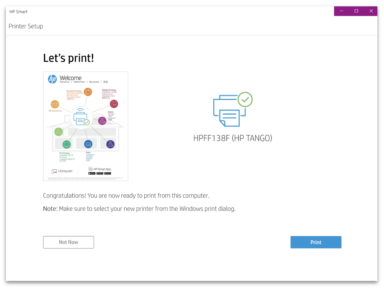
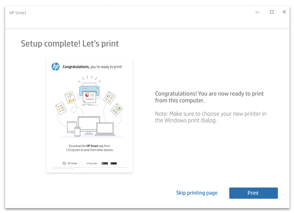
I also redesigned first print which was the last step of the printer setup process. The information hierarchy on the page, visuals, voice and tone definitely needed to be updated to ensure users had a positive last step. The overall intent for this was to celebrate and assure the user that their printer was ready for them to use it.
Objectives
Needs to really emphasize celebration of the completed setup
Name should just be name of printer, and picture if possible
Text should be more prominent in the information architecture
Logic Flow
I created a logic flow to define the interaction design. We reviewed this with development as well to ensure the design was implemented as desired.
Old Design
New Design

Link to design documentation:
https://drive.google.com/file/d/1cgfzejuBS17ljlhJGNNBSgloRuxZdMDx/view?usp=sharing
01
Evaluation
02
prioritization
03
Baseline
04
design iteration
05
impact
Delta Study
Incorporating best practices
Objective
To gauge whether the improvements we were making had a positive impact on experience metrics, we ran a second test to compare the user experience of the current Win 10 experience to the updated Win 10 designs.
I wrote the test, created the stimuli (two prototypes), and analyzed the qualitative and quantitative data.
Approach
Online unmoderated UserTesting.com test
Stimuli included two click through XD prototypes representing the current and new Win 10 workflows

Methods
26 users
PC users, typical person to set up a printer, PC setup path preferred
A/B Preference Test
NASA TLX Metrics

Outcomes + Impact
The overall conclusion was that the new design performed better across all key UX metrics.
The new Win 10 desktop experience performed better on almost all NASA TLX workload metrics
Users preferred the new Win 10 experience across all ux metrics: confidence, amount of steps, ease of use, use w/out assistance, and visual appeal
01
Evaluation
02
prioritization
03
Baseline
04
design iteration
05
impact
Reflections
Project challenges and mitigations
Overall, our team deemed the project a success. That didn't mean there weren't problems however.
Challenge #1:
Developer resistance to delivery of design changes
Mitigation: To support adoption of our new interaction design documentation, we prioritized developer education and clear communication around the rationale behind key design decisions. This project marked the first use of a newly established delivery structure for the Windows 10 and Mac development teams.
Initially, there was some friction, as the documentation was more detailed than what teams were accustomed to. We dedicated time to walk developers through the new format, explain how to navigate the deliverables, and clarify expectations. These efforts not only eased the transition but also fostered strong working relationships with both development teams—laying a solid foundation for future collaboration.
Challenge #2:
Deliberation between 2 possible design solutions
Mitigation: To resolve a design disagreement, we conducted hallway testing to gather quick user feedback. Ultimately, both my design and my manager’s were equally preferred by users. The final decision was made based on expert review and alignment with standard UI conventions, such as button placement best practices.
Company
Hewlett- Packard
Role
Interaction Designer and Researcher
Team
Teams
Teams
UX, Product, Engineering
Tools
Adobe XD, UserTesting.com, Excel
Timeline
4 Months
Timeline
4 Months
Background
Historically, the desktop version of the HP Smart App lagged behind its mobile counterpart due to a "mobile-first" development strategy.
Recognizing the significant number of legacy users still on desktop, our team lead and I aimed to enhance the desktop setup experience to improve user satisfaction and engagement.
Goals
Usability: Streamline the setup process for ease of use.
Consistency: Ensure uniformity across the user interface.
Voice & Tone: Align messaging with user expectations.
Process
Path to a more scalable, compelling website
01
Expert Evaluation
Creating a user journey
02
prioritization workshop
Aligning with stakeholders
03
baseline study
Gathering Baseline UX metrics
04
Design + Iteration
Competitive Analysis, design, Internal reviews
05
delta study + Impact Evaluation
sucess evaluation
01
Expert Evaluation
Expert Evaluation
Creating a user journey
02
Prioritization workshop
Prioritization workshop
Aligning with stakeholders
03
baseline study
baseline study
Gathering baseline UX metrics
04
Design + Iteration
Design + Iteration
competitive analysis, Design, internal reviews
05
Delta Study + impact evaluation
Delta Study + impact evaluation
Success Evaluation
01
02
03
04
05
Expert Evaluation
Journey mapping to identify hero moments and pain points
Approach
We began by mapping the user journey to identify key moments and pain points. This evaluation provided a comprehensive understanding of the user's experience and highlighted areas for improvement.
Prioritization Workshop
Aligning within the organization
Approach
Collaborating with stakeholders, we conducted workshops to pinpoint and prioritize issues. This collaborative approach ensured alignment and informed the redesign process.
Goals
Leverage our tribal knowledge of known customer problems to help inform the redesign
Create stakeholder buy-in for backlog prioritization
01
02
03
04
05
Baseline Study
Measuring the current experience
01
02
03
04
05
Objective
To establish a baseline, we conducted qualitative sessions in the San Diego office, focusing on the end-to-end setup flow. This study provided valuable insights into user frustrations and validated our journey map.
Approach
Conducted qualitative sessions in the San Diego office
Targeted end-to-end setup flow: from initial instructions to first print
Developed and used a discussion guide and embedded micro-surveys
Methods
Paused users at key journey points to capture immediate feedback
Collected both qualitative insights and ratings of ux metrics (time, confidence, ease of use, number of steps, success)
Outcomes
Clearer understanding of user frustrations
Validation of journey map pain points
Actionable input for redesign prioritization
Install Driver Redesign
One piece of the redesign
Overview
A critical component of the redesign was the driver installation process. Through collaboration with development teams, we enabled background downloading of drivers, reducing user intervention. This change decreased setup time and minimized user fatigue.
Preceding Steps
As a part of the design process, I looked at where users are coming from in the journey to see if there’s anything that could impact the experience once they get to the driver. In this case the copy in the loading screen preceding the driver was misleading, and we addressed this in the design updates.
01
02
03
04
05
Backend Work
We worked with development first of all to see if the driver could be first and foremost downloaded in the background automatically for the user. Negotiation led to this actually be the hero case with the instruction screen only accounting for ~30% of users. That meant that this was one less step in the set up journey that required actions from users, reducing overall fatigue and friction.
First we discussed with development if the driver could be downloaded in the background automatically for the user.
Negotiation led to this actually be the hero case with the instruction screen only accounting for ~30% of users. That meant that this was one less step in the set up journey that required action from users, reducing overall fatigue.
Competitive Analysis
I also looked at examples of step by step instructions across other platforms especially focusing on devices that intersect with a hardware component to help identify best practices for the driver install screen re design.
Iterations
I went through around 7 version of this install driver design, continuously reviewing them with our design and development teams.
Final Design
Ultimately quick hallway testing helped inform the final direction that was delivered to development.
Final deliverable can be found here: https://drive.google.com/file/d/1DVZM2Is14AsbAKEUrqDW2LyB8Wz8gLS3/view?usp=sharing
Defining Scope
Defining Scope
Defining Scope
There are two types of driver installations that occur in OOBE. The scope of this deliverable was only for the Manual Driver Install Case.
Auto-matic Install
During automatic install there is no inputs required from the user.
Manual Driver Install
During manual driver install the user need to open OS settings and manually add the device to their OS.
Use Cases
Use Cases
Use Cases
There are multiple use cases where users will see the instructions to install the print driver.
Use Case 1: OOBE
This occurs during printer setup if auto-matic install fails. In this case the user needs to manually install the driver.
Use Case 2: Post-OOBE
If automatic and manual driver install is unsuccessful during OOBE, then the user will need to reattempt driver install if they attempt to print something from the Smart app.
Logic Flow
Logic Flow
Logic Flow
Based on the scope and use cases we aligned on with development, I created a logic flow to define the interaction design. We reviewed this with development as well to ensure the design was implemented as desired.
Based on the scope and use cases we aligned on with development, I created a logic flow to define the interaction design. We reviewed this with development as well to ensure the design was implemented as desired.
Based on the scope and use cases we aligned on with development, I created a logic flow to define the interaction design. We reviewed this with development as well to ensure the design was implemented as desired.
First Print Redesign
One piece of the redesign
Background
I also redesigned first print which was the last step of the printer setup process. The information hierarchy on the page, visuals, voice and tone definitely needed to be updated to ensure users had a positive last step. The overall intent for this was to celebrate and assure the user that their printer was ready for them to use it.
Objectives
Needs to really emphasize celebration of the completed setup
Name should just be name of printer, and picture if possible
Text should be more prominent in the information architecture
01
02
03
04
05
Old Design
New Design

Documentation
Link to design documentation:
https://drive.google.com/file/d/1cgfzejuBS17ljlhJGNNBSgloRuxZdMDx/view?usp=sharing
First Print Redesign
One piece of the redesign
Background
I also redesigned first print which was the last step of the printer setup process. The information hierarchy on the page, visuals, voice and tone definitely needed to be updated to ensure users had a positive last step. The overall intent for this was to celebrate and assure the user that their printer was ready for them to use it.
Objectives
Needs to really emphasize celebration of the completed setup
Name should just be name of printer, and picture if possible
Text should be more prominent in the information architecture
01
02
03
04
05
Old Design

New Design
Documentation
Link to design documentation:
https://drive.google.com/file/d/1cgfzejuBS17ljlhJGNNBSgloRuxZdMDx/view?usp=sharing
Logic Flow
Logic Flow
Needs to really emphasize celebration of the completed setup.Based on the scope and use cases we aligned on with development, I created a logic flow to define the interaction design. We reviewed this with development as well to ensure the design was implemented as desired.
I created a logic flow to define the interaction design. We reviewed this with development as well to ensure the design was implemented as desired.
Delta Study
Incorporating best practices
Objective
To gauge whether the improvements we were making had a positive impact on experience metrics, we ran a second test to compare the user experience of the current Win 10 experience to the updated Win 10 designs.
I wrote the test, created the stimuli (two prototypes), and analyzed the qualitative and quantitative data.
Approach
Online unmoderated UserTesting.com test
Stimuli included two click through XD prototypes representing the current and new Win 10 workflows
Outcomes and Impact
The overall conclusion was that the new design performed better across all key UX metrics.
The new Win 10 desktop experience performed better on almost all NASA TLX workload metrics
Users preferred the new Win 10 experience across all ux metrics: confidence, amount of steps, ease of use, use w/out assistance, and visual appeal
Methods
26 users
PC users, typical person to set up a printer, PC setup path preferred
A/B Preference Test
NASA TLX Metrics
01
02
03
04
05
Reflections
Project challenges and mitigations
Overall, our team deemed the project a success. That didn't mean there weren't problems however.
Challenge #1:
Developer resistance to delivery of design changes
Mitigation: To support adoption of our new interaction design documentation, we prioritized developer education and clear communication around the rationale behind key design decisions. This project marked the first use of a newly established delivery structure for the Windows 10 and Mac development teams.
Initially, there was some friction, as the documentation was more detailed than what teams were accustomed to. We dedicated time to walk developers through the new format, explain how to navigate the deliverables, and clarify expectations. These efforts not only eased the transition but also fostered strong working relationships with both development teams—laying a solid foundation for future collaboration.
Challenge #2:
Deliberation between 2 possible design solutions
Mitigation: To resolve a design disagreement, we conducted hallway testing to gather quick user feedback. Ultimately, both my design and my manager’s were equally preferred by users. The final decision was made based on expert review and alignment with standard UI conventions, such as button placement best practices.
01
02
03
04
05