Company
GoPro
Role
Lead Product Designer
Teams
Product, Operations, Creative/Studio
Tools
Figma
Timeline
2 Months
Background
The goal of this project was to redesign the camera landing page to enhance user engagement, improve navigation, and increase conversion rates. By analyzing user behavior and gathering stakeholder feedback, we identified key friction points and opportunities for better presentation of product features and benefits.
This redesign aims to better showcase our camera offerings, drive higher sales, and support long-term growth.
Goals and Impact
Goals
Effectively showcase new cameras
Clear and compelling design that highlights unique features and benefits of each camera
Tell a brand story
Impacts
31% increase in revenue per visitor
Revenue increase primarily driven by an increase of 29% in Average Order Value.
A 32% decline in exit rate and increase in overall page activity (clicks, scrolls, swipes) indicates shoppers find the page more engaging and compelling
Before
After
Process
Path to a more scalable, compelling webpage
01
Desk Research
Existing research insights
02
Strategy Ideation
co-creating an approach
03
iterative design
Internal and External Reviews
04
reflections
REflection and ux impact
01
Desk Research
02
strategy
03
iterative design
04
reflections
Desk Research
Learning best practices
Approach
We evaluated best practices from the Baymard Institute to identify and reduce UX friction. This approach facilitated stakeholder buy-in and streamlined the research process.
Goals + Rationales
Rely on established e-comm industry standards to identify and reduce UX friction
Create stakeholder buy-in for backlog prioritization
Reduce redundancy in research to speed up the process


01
Desk research
02
strategy
03
iterative design
04
reflections
Strategy
Co-creating the best approach
Approach
We held a design thinking workshop with our UX team to explore various approaches for shaping the content of the camera landing page.
During the workshop, we reviewed examples of category landing pages from other websites and analyzed what worked well and what didn’t in each case.


Outcome
The workshop gave us a clear understanding of the key elements to include on our camera landing page.
We also prioritized these elements by importance to help guide UX decisions and focus on what would deliver the most value.
01
desk research
02
strategy
03
iterative design
04
reflections
Wireframes
Wireframes
Wireframes
Mapping the UX
Mapping the UX
Mapping the UX
Approach
Approach
Approach
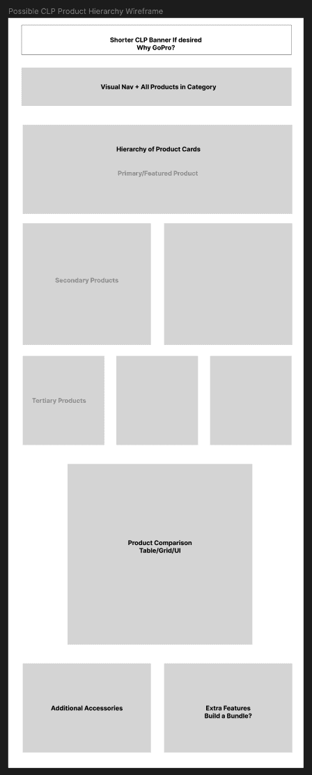
Following the workshop, we aligned on a rough concept for an ideal camera comparison page, which I then used as a foundation for further development.
Following the workshop, we aligned on a rough concept for an ideal camera comparison page, which I then used as a foundation for further development.
Following the workshop, we aligned on a rough concept for an ideal camera comparison page, which I then used as a foundation for further development.
Round 1
Round 1
Round 1
Coming out of the workshop, we aligned on an initial concept for an ideal camera comparison page, which I then used as a starting point for my design work.
Coming out of the workshop, we aligned on an initial concept for an ideal camera comparison page, which I then used as a starting point for my design work.
Coming out of the workshop, we aligned on an initial concept for an ideal camera comparison page, which I then used as a starting point for my design work.

Round 2
Round 2
Round 2
The top two options were selected based on internal reviews with the UX, Creative, and Product teams.
The top two options were selected based on internal reviews with the UX, Creative, and Product teams.
The top two options were selected based on internal reviews with the UX, Creative, and Product teams.

01
02
03
04
01
02
03
04
01
Gather requirements
02
empathy mapping
03
design+ iteration
04
Reflections
External Teams Review
External Teams Review
External Teams Review
One piece of the redesign
One piece of the redesign
One piece of the redesign
External Team Review Feedback
External Team Review Feedback
External Team Review Feedback
The product team responded positively to the overall design directions. Their primary feedback centered on how to effectively categorize camera types on the page. They emphasized the need for scalability, noting that different categories would grow at varying rates over time. Additionally, they strongly advocated for clear distinctions between camera categories to support customer education.
In response, I developed several scalable design approaches that addressed their concerns and allowed for flexible category expansion.
While we had designs prepared for various scenarios of category growth, I also encouraged the product team to share more details about upcoming product launches to help determine the most suitable path forward.

Direction Clarification
Direction Clarification
Direction Clarification
Soon after, we received clarification on the camera launch schedule.
Due to product delays, only one camera was set to launch in a new category. As a result, we opted for a more flexible page structure using sections like “Featured” and “Explore More” to spotlight key new cameras.
We held on to the more detailed categorization strategies for future use, when a broader expansion of unique camera categories is expected.

01
02
03
04
01
02
03
04
01
Gather requirements
02
empathy mapping
03
design+ iteration
04
Reflections
UX Documentation
UX Documentation
UX Documentation
Delivering full page deliveries and modules
Delivering full page deliveries and modules
Delivering full page deliveries and modules
Module Delivery
Module Delivery
Module Delivery
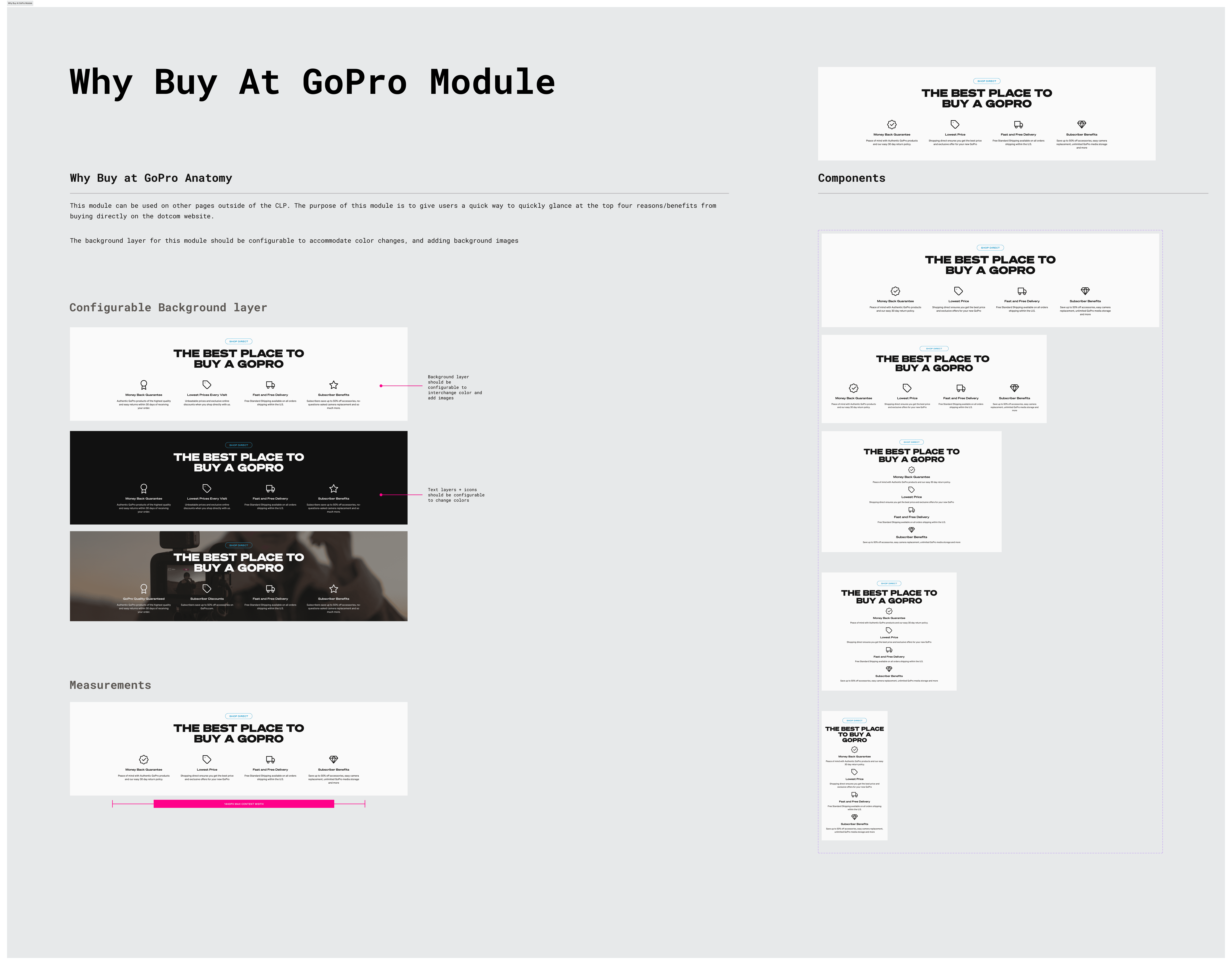
Alongside designing the full camera landing page, we also aimed to have development build new modules that could be added to our site-wide library for broader use.
In total, we had five new modules to define. I collaborated with the Creative team on asset specifications and worked closely with the development team to iterate on the details, ensuring each solution was practical and feasible to implement.


Page Delivery
Page Delivery
Page Delivery
I created pixel-perfect page designs for our five breakpoints, including the key essential states, and handed them off to the development team. During our working sessions, I presented the designs, walked the team through the details, and addressed any questions that arose.
I created pixel-perfect page designs for our five breakpoints, including the key essential states, and handed them off to the development team. During our working sessions, I presented the designs, walked the team through the details, and addressed any questions that arose.
I created pixel-perfect page designs for our five breakpoints, including the key essential states, and handed them off to the development team. During our working sessions, I presented the designs, walked the team through the details, and addressed any questions that arose.

01
02
03
04
01
02
03
04
01
Gather requirements
02
empathy mapping
03
design+ iteration
04
Reflections
Reflections
Reflections
Overall, our team deemed the project a success!
Overall, our team deemed the project a success!
The new Camera Landing Page (CLP) generates 31% more revenue per visitor compared to the previous version, mainly driven by a 29% increase in average order value. This reflects how the more premium feel of the CLP effectively boosts sales of our higher-end cameras.
Additionally, there’s been a 32% drop in exit rates alongside increased overall page activity—such as clicks, scrolls, and swipes—showing that shoppers find the page more engaging and compelling.
Two comparison modules on the CLP help shoppers evaluate different cameras and determine which best fits their needs. These modules have the highest engagement rates of all on the page, highlighting their value at this stage of the customer journey:
“Discover the Line-up” module: 28% attractiveness rate
“Camera Compare” module: 63% attractiveness rate
Overall, there were no negative analytics associated with the launch of the new page.
One notable observation was that the top two modules had lower engagement rates compared to the product cards, lineup module, and compare module. We discussed running future A/B tests to experiment with the order of these top-of-page modules to identify the most effective arrangement. However, this was deprioritized in favor of addressing more urgent issues elsewhere on the site.
01
02
03
04
05
01
02
03
04
Company
Hewlett- Packard
GoPro
GoPro
Role
Interaction Designer
Lead Product Designer
Lead Product Designer
Team
Teams
Teams
UX, Legal, Product, Engineering
Tools
Adobe XD
Figma
Figma
Timeline
2 months
Timeline
2 Months
Background
A change in HP's privacy policy necessitated updates to the HP Smart App. The design team was tasked with collaborating across business, legal, marketing, and development departments to provide a comprehensive UX framework and implement the updates across all platforms: iOS, Android, Windows, and Mac.
As an Interaction Designer on the Printer Setup team, I worked closely with these cross-functional teams to ensure a cohesive and compliant user experience.
The goal of this project was to redesign the camera landing page to enhance user engagement, improve navigation, and increase conversion rates. By analyzing user behavior and gathering stakeholder feedback, we identified key friction points and opportunities for better presentation of product features and benefits.
This redesign aims to better showcase our camera offerings, drive higher sales, and support long-term growth.
Goals
Effectively showcase new cameras
Clear and compelling design that highlights unique features and benefits of each camera
Tell a brand story
Tell a brand story
Process
Path to a more scalable, compelling website
Path to a more scalable, compelling webpage
Path to a more scalable, compelling webpage
01
Desk Research
Existing research insights
02
Strategy Ideation
co-creating an approach
03
Iterative design
internal and external reviews
04
reflections
Reflection and ux impact
01
Desk Research
Existing research insights
02
Strategy Ideation
co-creating an approach
03
iterative design
Internal and External Reviews
04
reflections
REflection and ux impact
01
02
03
04
Gathering Requirements
Desk Research
Desk Research
Understanding new data collection parameters
Learning best practices
Learning best practices
Approach
The project commenced with documenting data collection sources and purposes, in collaboration with legal and engineering teams.
Previously, the HP Smart App required users to intentionally opt-in for any data collection related to their phone and printer. With the new framework, data collection deemed essential for basic app functions was integrated into the terms of use, requiring user agreement to proceed. If a user wanted to use the app, they need to agree to those terms. Additionally, users were provided with clear options to opt-in or out of platform-specific usage data not essential for app functionality.
We evaluated best practices from the Baymard Institute to identify and reduce UX friction. This approach facilitated stakeholder buy-in and streamlined the research process.
We evaluated best practices from the Baymard Institute to identify and reduce UX friction. This approach facilitated stakeholder buy-in and streamlined the research process.
Goals + Rationales
Rely on established e-comm industry standards to identify and reduce UX friction
Create stakeholder buy-in for backlog prioritization
Reduce redundancy in research to speed up the process
Goals + Rationales
Rely on established e-comm industry standards to identify and reduce UX friction
Create stakeholder buy-in for backlog prioritization
Reduce redundancy in research to speed up the process
Empathy Mapping Workshop
Strategy
Strategy
Aligning within the organization
Co-creating the best approach
Co-creating the best approach
Approach
We conducted a design thinking workshop with designers from the Setup and App teams to develop an empathy framework. This collaboration facilitated alignment across teams and a unified vision.
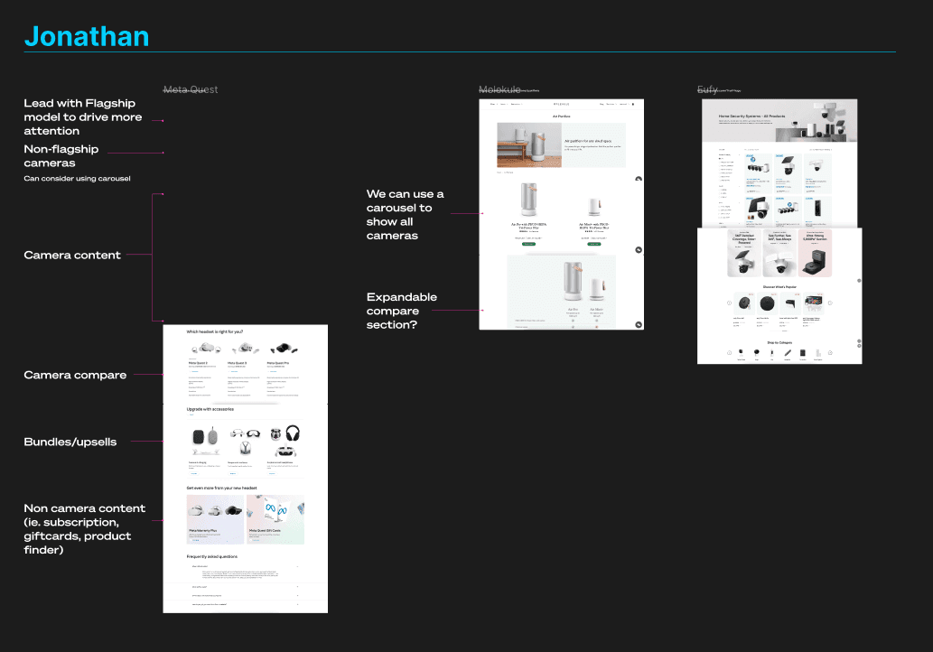
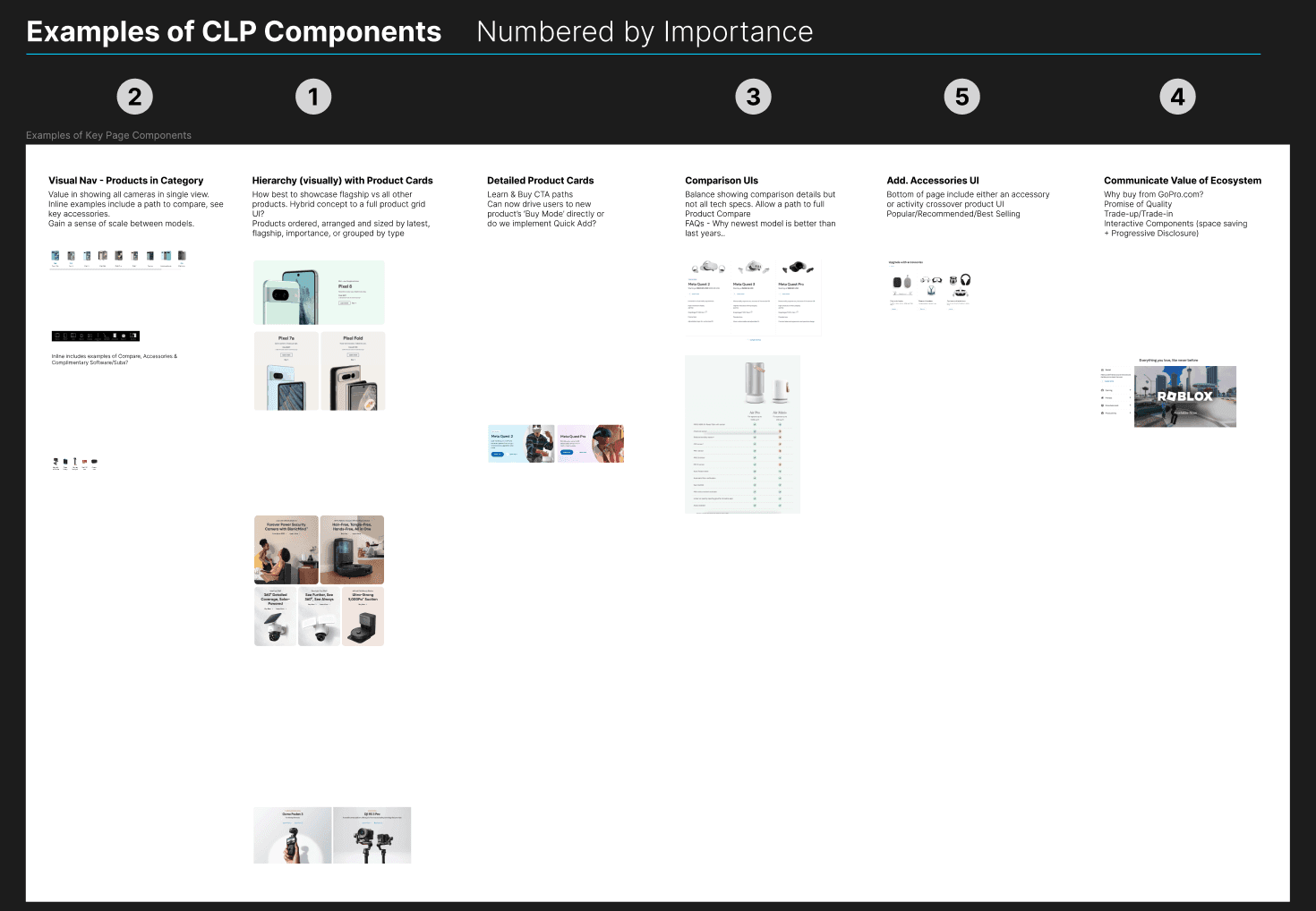
We held a design thinking workshop with our UX team to explore various approaches for shaping the content of the camera landing page.
During the workshop, we reviewed examples of category landing pages from other websites and analyzed what worked well and what didn’t in each case.
We held a design thinking workshop with our UX team to explore various approaches for shaping the content of the camera landing page.
During the workshop, we reviewed examples of category landing pages from other websites and analyzed what worked well and what didn’t in each case.
01
02
03
04
Outcome
The workshop gave us a clear understanding of the key elements to include on our camera landing page.
We also prioritized these elements by importance to help guide UX decisions and focus on what would deliver the most value.
Outcome
The workshop gave us a clear understanding of the key elements to include on our camera landing page.
We also prioritized these elements by importance to help guide UX decisions and focus on what would deliver the most value.
Goals
Effectively showcase new cameras
Clear and compelling design that highlights unique features and benefits of each camera
Tell a brand story
Impacts
31% increase in revenue per visitor
Revenue increase primarily driven by an increase of 29% in Average Order Value.
A 32% decline in exit rate and increase in overall page activity (clicks, scrolls, swipes) indicates shoppers find the page more engaging and compelling
Impacts
31% increase in revenue per visitor
Revenue increase primarily driven by an increase of 29% in Average Order Value.
A 32% decline in exit rate and increase in overall page activity (clicks, scrolls, swipes) indicates shoppers find the page more engaging and compelling
Check it out in the wild
Before
After
Before
After