Company
Company
Company
GoPro
GoPro
GoPro
Role
Role
Role
Lead Product Designer
Lead Product Designer
Lead Product Designer
Teams
Teams
Teams
User Research, Product, Operations, Creative/Studio
User Research, Product, Operations, Creative/Studio
User Research, Product, Operations, Creative/Studio
Tools
Tools
Tools
Figma
Figma
Figma
Timeline
Timeline
Timeline
3 months
3 months
3 months
Background
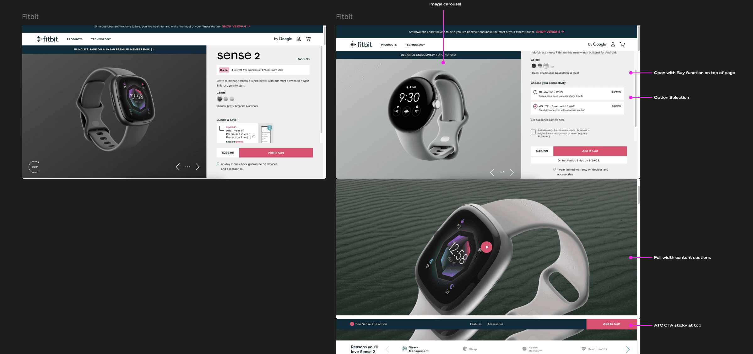
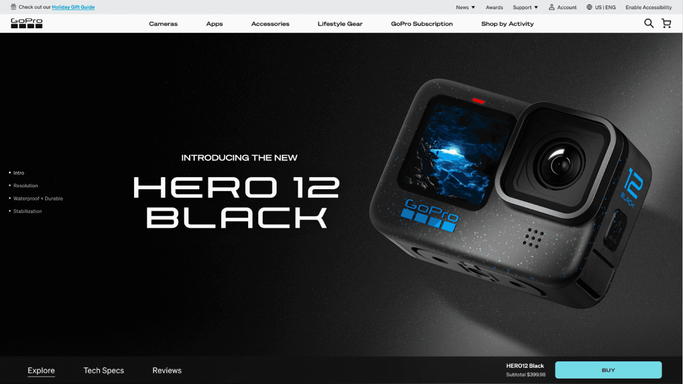
GoPro's original camera product detail pages (PDPs) combined extensive information about core camera offerings and subscriptions into a single page.
As the company expanded its product lineup, this approach led to information overload and scalability issues, prompting the need for a redesigned PDP that could enhance user experience and accommodate future growth.
Background
GoPro's original camera product detail pages (PDPs) combined extensive information about core camera offerings and subscriptions into a single page.
As the company expanded its product lineup, this approach led to information overload and scalability issues, prompting the need for a redesigned PDP that could enhance user experience and accommodate future growth.
Overview
Problems
Problems
Problems
Improve Conversion and Revenue: The existing PDPs had an over 80% dropout rate, with users overwhelmed by large blocks of text and combined "Learn" and "Buy" journeys.
Scalability:
The design was not adaptable for future product offerings, limiting GoPro's ability to expand its eCommerce presence effectively.
Solution
We separated the "Learn" and "Buy" journeys into distinct pages, allowing users to focus on either exploring camera features or purchasing options.
This focused approach reduced user friction and increased engagement.
Results:
19% increase in checkout rate from the Product Details page.
Enhanced user engagement through streamlined content and navigation.

Process
Process
Process
Path to a more scalable, compelling website
Path to a more scalable, compelling website
Path to a more scalable, compelling website
01
INitial user research
UX pain points + Gopro.com perceptions
02
Desk research
Existing research insights
03
Competitive audit
PDP COPY, VISUALS, INFO HIERARCHY + q&a SEMANTIC ANALYSIS
04
Design + Iteration
UX exploration + optimization
05
impact evaluation
evaluation of success
01
INitial user research
UX pain points + Gopro.com perceptions
02
Desk research
Existing research insights
03
Competitor Audit
PDP COPY, VISUALS, INFO HIERARCHY + q&a SEMANTIC ANALYSIS
04
Design + Iteration
UX exploration + optimization
05
Impact Evaluation
evaluation of success
01
INitial user research
INitial user research
UX pain points + Gopro.com perceptions
02
Desk research
Desk research
Existing research insights
03
Competitor audit
PDP COPY, VISUALS, INFO HIERARCHY + q&a SEMANTIC ANALYSIS
04
Design + Iteration
Design + Iteration
UX exploration + optimization
05
impact evaluation
impact evaluation
evaluation of success
01
Initial research
02
desk research
03
competitive audit
04
design iteration
05
impact evaluation
Goals + Initial Pain Points
Goals + Initial Pain Points
Goals + Initial Pain Points
Understanding the user and business problems
Understanding the user and business problems
Understanding the user and business problems
As a team we aligned on business objectives and identified design goals that would help us achieve those objectives.
We also looked at analytic data to help us identify the most impactful areas of the experience to improve.
As a team we aligned on business objectives and identified design goals that would help us achieve those objectives.
We also looked at analytic data to help us identify the most impactful areas of the experience to improve.
As a team we aligned on business objectives and identified design goals that would help us achieve those objectives.
We also looked at analytic data to help us identify the most impactful areas of the experience to improve.
01
02
03
04
05
Boost Revenue
=
Improved Conversion
+
Optimize XSell
+
Increase AOV
Improved Conversion
=
Pain Points
Reduce Friction
Nearly 1 in 4 purchase intenders end up not making a purchase decision
Can’t find specs
Can’t find info needed
Feel too long to scroll
Inefficient/ effective nav
Maintain Engagement
Nearly 85% of users drop off before seeing content modules
Users lose interest in PDPs
Boring, mediocre
Text heavy
Irrelevant / too action-driven
Provide Sufficient Info
Not sure what else I should buy
Not sure what’s included already
Not sure if GoPro Subscription is mandatory
Goals
Improve navigation to optimize information discovery
Improve content layout to help shoppers locate information
Reduce bounce by
Surfacing exciting contents up front
Removing blocks of text (especially on mobile)
Offering more use cases
Surface Shop by Activity + top selling accessories
Surface “Whats’ Included”
Offer scalable UX to future proof it
Nearly no one is buying recommended items from the intersitial
01
Initial research
02
desk research
03
competitive audit
04
design iteration
05
impact evaluation
Desk Research
Desk Research
Desk Research
Learning best practices
Learning best practices
Learning best practices
Approach
Approach
Approach
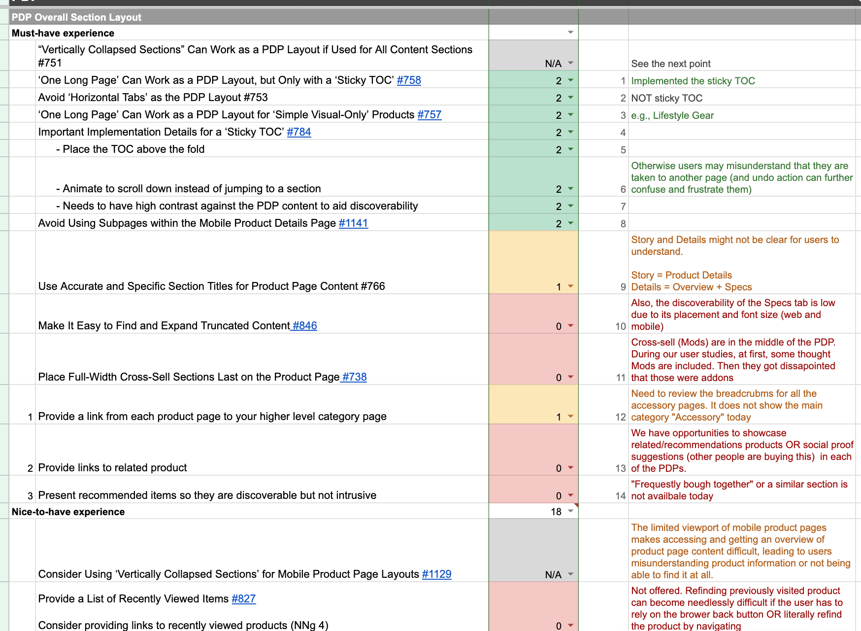
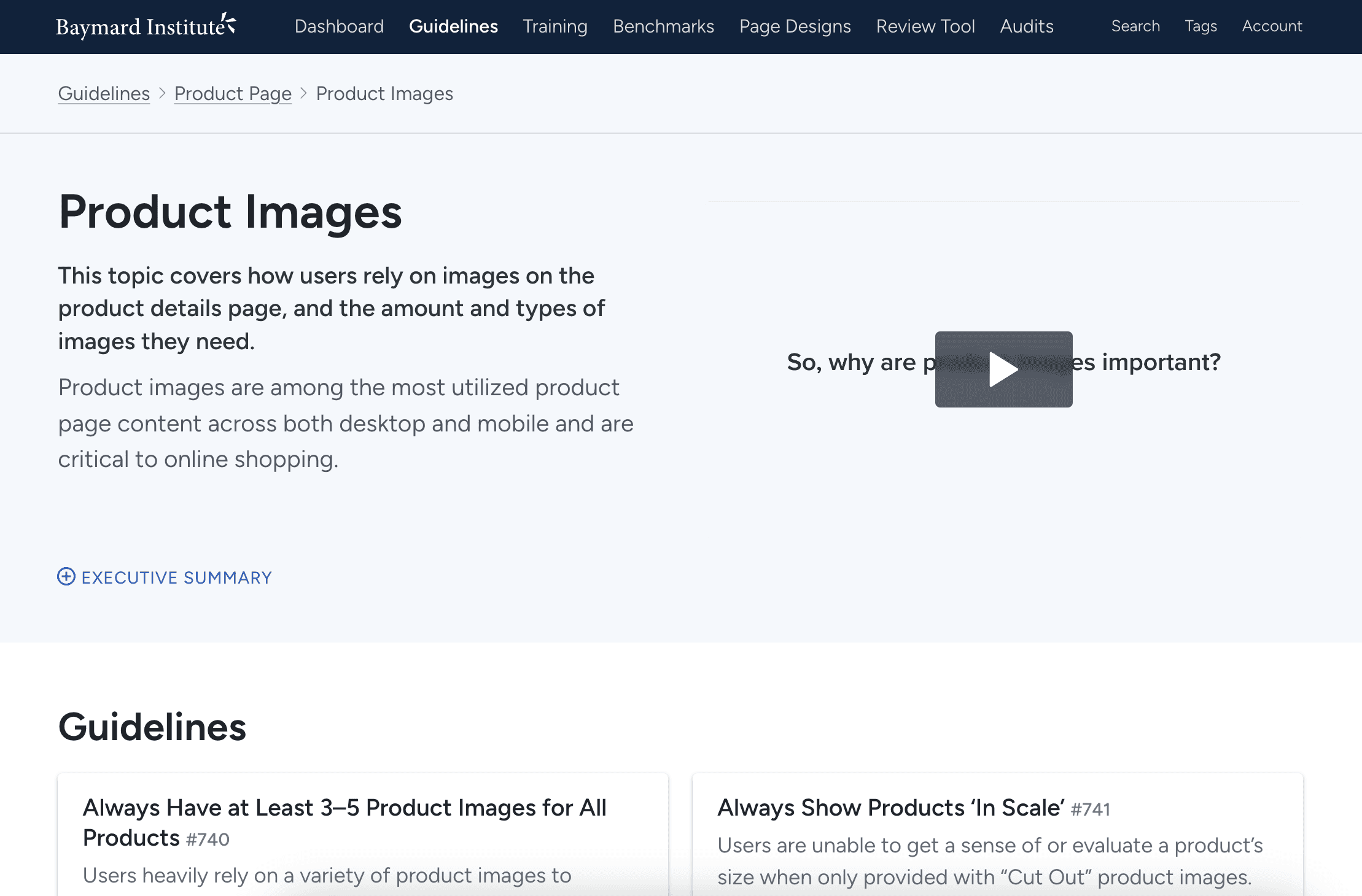
We evaluated best practices from the Baymard Institute and Nielsen Norman Group to identify and reduce UX friction. This approach facilitated stakeholder buy-in and streamlined the research process
We evaluated best practices from the Baymard Institute and Nielsen Norman Group to identify and reduce UX friction. This approach facilitated stakeholder buy-in and streamlined the research process
We evaluated best practices from the Baymard Institute and Nielsen Norman Group to identify and reduce UX friction. This approach facilitated stakeholder buy-in and streamlined the research process
Goals + Rationales
Goals + Rationales
Goals + Rationales
Rely on established e-comm industry standards to identify and reduce UX friction
Create stakeholder buy-in for backlog prioritization
Reduce redundancy in research to speed up the process
Rely on established e-comm industry standards to identify and reduce UX friction
Create stakeholder buy-in for backlog prioritization
Reduce redundancy in research to speed up the process
Rely on established e-comm industry standards to identify and reduce UX friction
Create stakeholder buy-in for backlog prioritization
Reduce redundancy in research to speed up the process


01
02
03
04
05
01
Initial research
02
desk research
03
competitive audit
04
design iteration
05
impact evaluation
Competitive Audit
Competitive Audit
Competitive Audit
Exploring current patterns
Exploring current patterns
Exploring current patterns
Approach
Approach
Approach
By examining how leading eCommerce websites structure product stories and content, we identified effective UX patterns and gathered insights to inform our redesign strategy.
By examining how leading eCommerce websites structure product stories and content, we identified effective UX patterns and gathered insights to inform our redesign strategy.
By examining how leading eCommerce websites structure product stories and content, we identified effective UX patterns and gathered insights to inform our redesign strategy.
Goals
Goals
Goals
Broaden perspectives + identify best-in-class practices
Identify effective UX patterns to explore + test
Learn how other companies address user needs
Audit pros and cons through comparison to mitigate risks
Gain inspiration
Broaden perspectives + identify best-in-class practices
Identify effective UX patterns to explore + test
Learn how other companies address user needs
Audit pros and cons through comparison to mitigate risks
Gain inspiration
Broaden perspectives + identify best-in-class practices
Identify effective UX patterns to explore + test
Learn how other companies address user needs
Audit pros and cons through comparison to mitigate risks
Gain inspiration
01
02
03
04
05
01
Initial research
02
desk research
03
competitive audit
04
design iteration
05
impact evaluation
Design + Iterate
Design + Iterate
Design + Iterate
Iterative design and qualitative testing
Iterative design and qualitative testing
Iterative design and qualitative testing
We conducted 4 rounds of unmoderated small sample usability testing to optimize the new new user experience.
We conducted 4 rounds of unmoderated small sample usability testing to optimize the new new user experience.
We conducted 4 rounds of unmoderated small sample usability testing to optimize the new new user experience.
Each testing round had a particular focus are to gather insights on:
Full Page vs Drawer
Desktop Navigation
Mobile Navigation
Buy Page Layout
Each testing round had a particular focus are to gather insights on:
Full Page vs Drawer
Desktop Navigation
Mobile Navigation
Buy Page Layout
Each testing round had a particular focus are to gather insights on:
Full Page vs Drawer
Desktop Navigation
Mobile Navigation
Buy Page Layout

01
02
03
04
05
01
Initial research
02
desk research
03
competitive audit
04
design iteration
05
impact evaluation
Test 1: Full page vs Drawer
Test 1: Full page vs Drawer
Test 1: Full page vs Drawer
First round of concept testing
First round of concept testing
First round of concept testing
Desk research and the competitive audit revealed that separating the current camera product page into two distinct pages—“Shop” and “Learn”—was a promising direction worth pursuing.
I developed a range of design concepts and shared them through internal reviews to gather feedback and align on two key variants for user testing.
Separate full pages
Separate full pages
Separate full pages
“Buy” page as a sliding drawer

Both design concepts performed well in testing, with no significant usability issues identified.
The next step was to evaluate whether either concept offered advantages in terms of implementation efficiency or SEO performance.
Both design concepts performed well in testing, with no significant usability issues identified.
The next step was to evaluate whether either concept offered advantages in terms of implementation efficiency or SEO performance.
Both design concepts performed well in testing, with no significant usability issues identified.
The next step was to evaluate whether either concept offered advantages in terms of implementation efficiency or SEO performance.
“Buy” page as a sliding drawer
01
02
03
04
05
01
Initial research
02
desk research
03
competitive audit
04
design iteration
05
impact evaluation
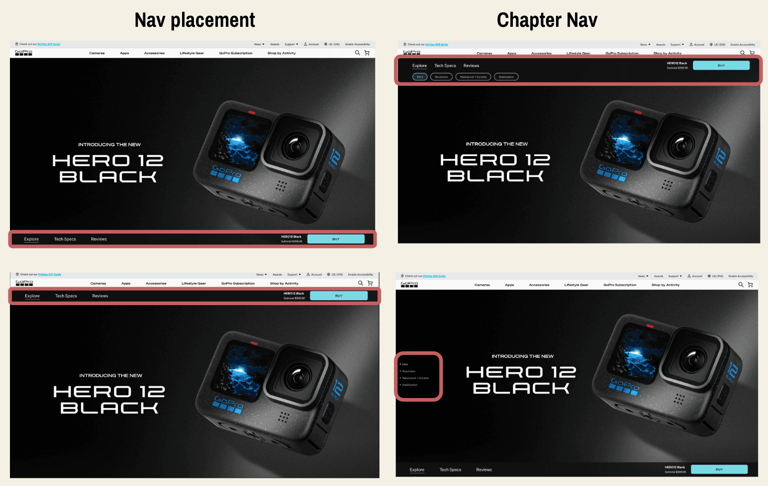
Test 2: Navigation
Test 2: Navigation
Test 2: Navigation
2nd Mobile and Desktop Variants
2nd Mobile and Desktop Variants
2nd Mobile and Desktop Variants
After confirming the effectiveness of the split-page approach through user testing, we shifted our focus to optimizing the navigation between the “Shop” and “Learn” pages.
To ensure a seamless experience across devices, we tested desktop and mobile navigation patterns separately, identifying which designs worked best for each platform.
Mobile
Mobile
Mobile
Top navigation bar
Top navigation bar
Top navigation bar


Bottom navigation bar

Bottom navigation bar + side “Jump to” chapters
Bottom navigation bar + side “Jump to” chapters
Bottom navigation bar + side “Jump to” chapters

Top navigation bar + side “Jump to” chapters

Bottom navigation bar
Top navigation bar + side “Jump to” chapters
Bottom navigation bar
Desktop
Desktop
Desktop
Top navigation bar
Top navigation bar
Top navigation bar
Bottom navigation bar
Bottom navigation bar
Bottom navigation bar + side “Jump to” chapters
Bottom navigation bar + side “Jump to” chapters
Bottom navigation bar + side “Jump to” chapters
Top navigation bar + pill “Jump to” chapters

Top navigation bar + pill “Jump to” chapters
Winners
Winners
Winners
Bottom navigation bar
Bottom navigation bar
Bottom navigation bar
Top navigation bar + pill “Jump to” chapters
Overall, the top navigation design—featuring visible subpages with chapter-style links—performed best in testing, as it closely aligned with users’ mental models.
Participants also appreciated seeing the price displayed on the initial “Learn” page, finding it helpful for quickly understanding product value.
01
02
03
04
05
01
Initial research
02
desk research
03
competitive audit
04
design iteration
05
impact evaluation
01
02
03
04
05
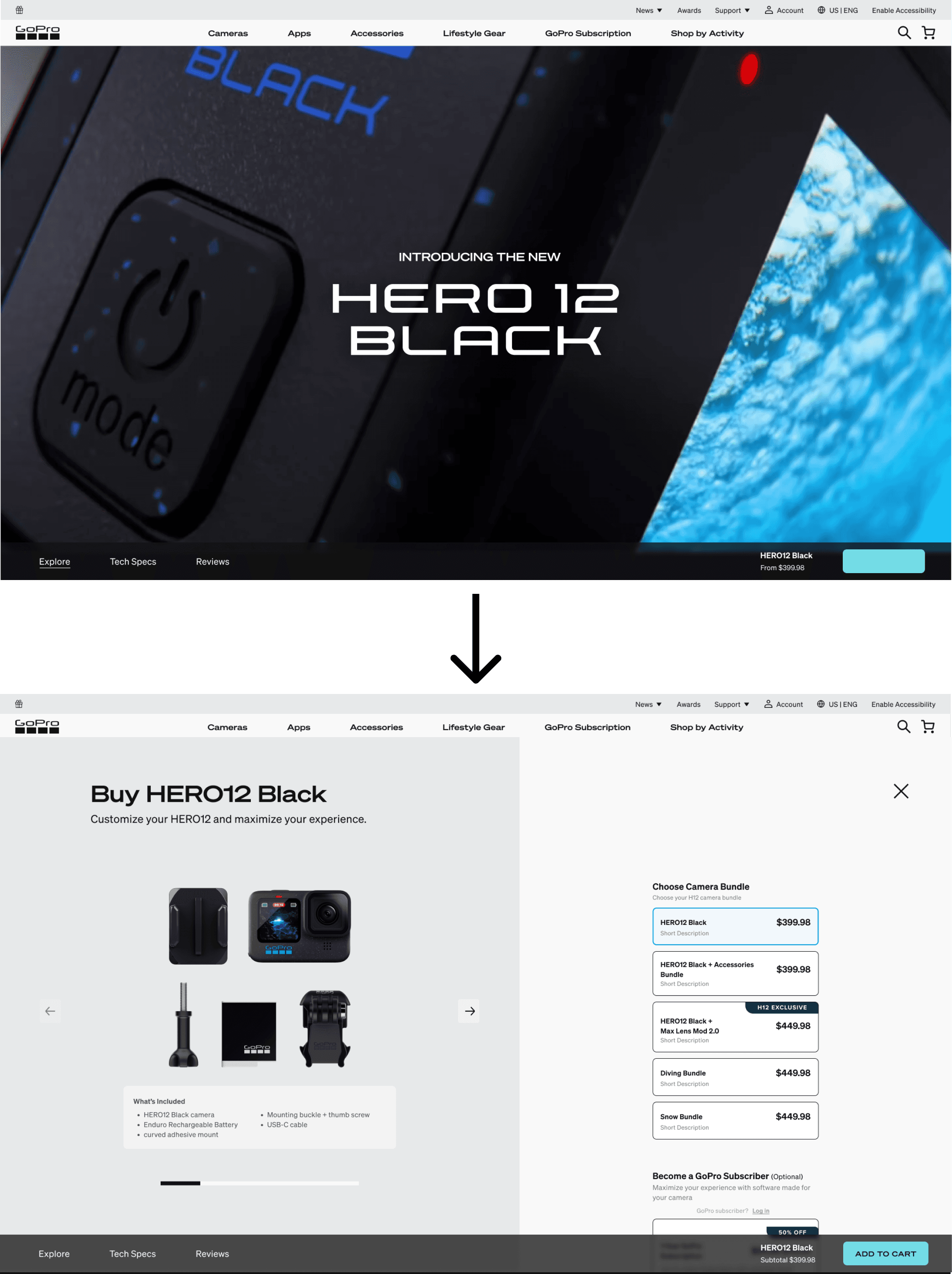
Test 3: Buy Mode + Interstitial
Test 3: Buy Mode + Interstitial
Test 3: Buy Mode + Interstitial
Testing the best purchase path
Testing the best purchase path
Testing the best purchase path
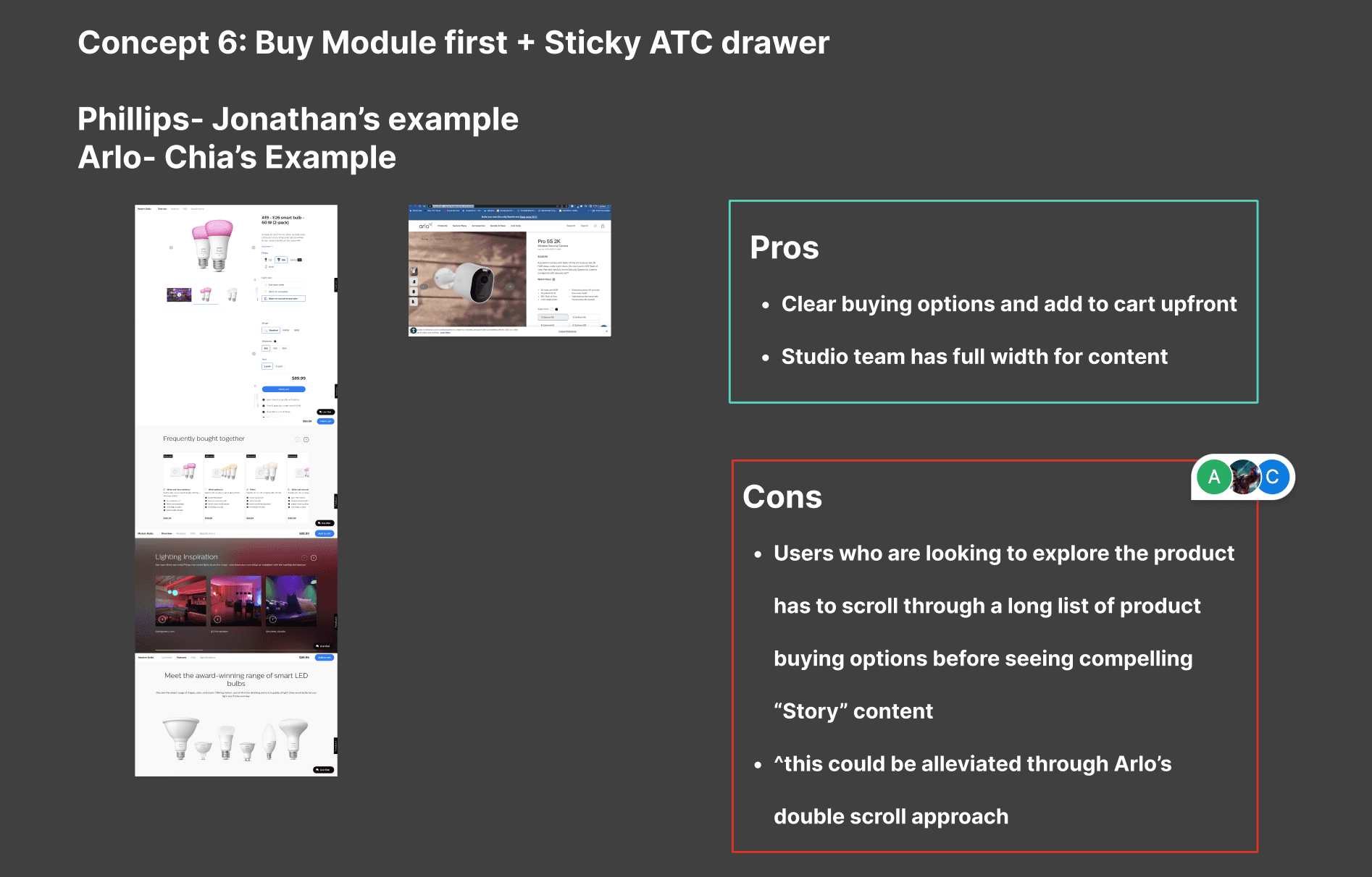
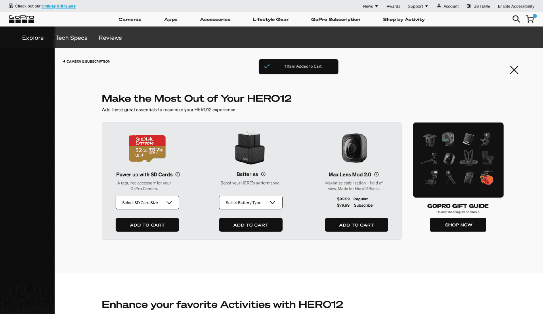
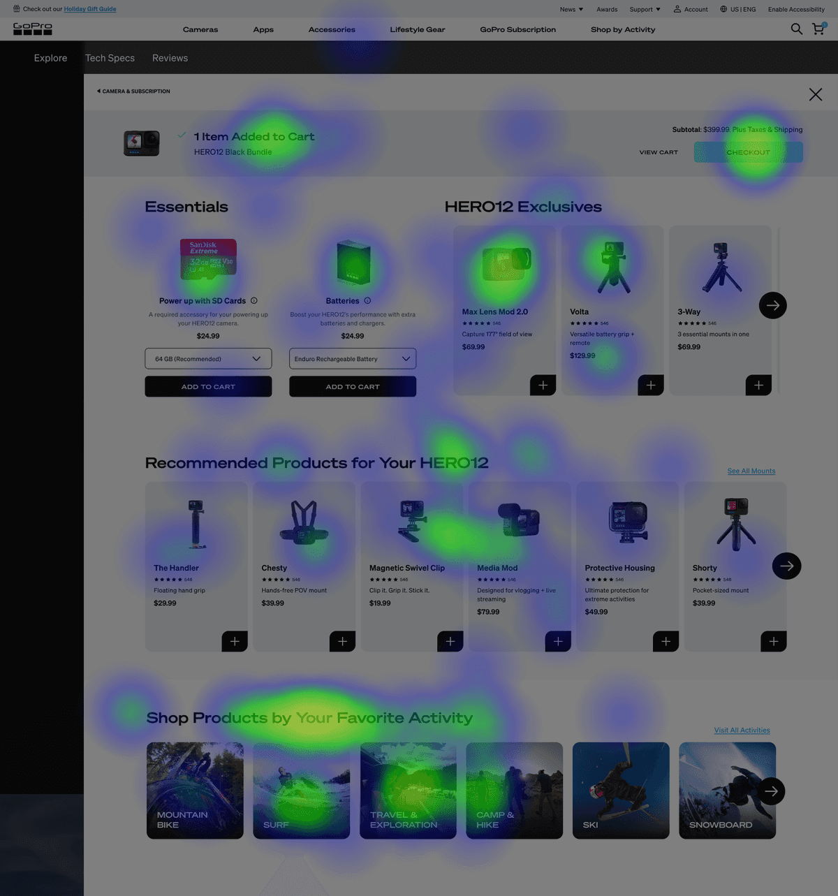
We also tested various “Buy” and interstitial designs to determine which formats were most effective at confirming add-to-cart actions and supporting upsell opportunities.
We also tested various “Buy” and interstitial designs to determine which formats were most effective at confirming add-to-cart actions and supporting upsell opportunities.
We also tested various “Buy” and interstitial designs to determine which formats were most effective at confirming add-to-cart actions and supporting upsell opportunities.
Four Desktop “Buy” page + Interstitial Variants
Four Desktop “Buy” page + Interstitial Variants
Four Desktop “Buy” page + Interstitial Variants


Overall Winner
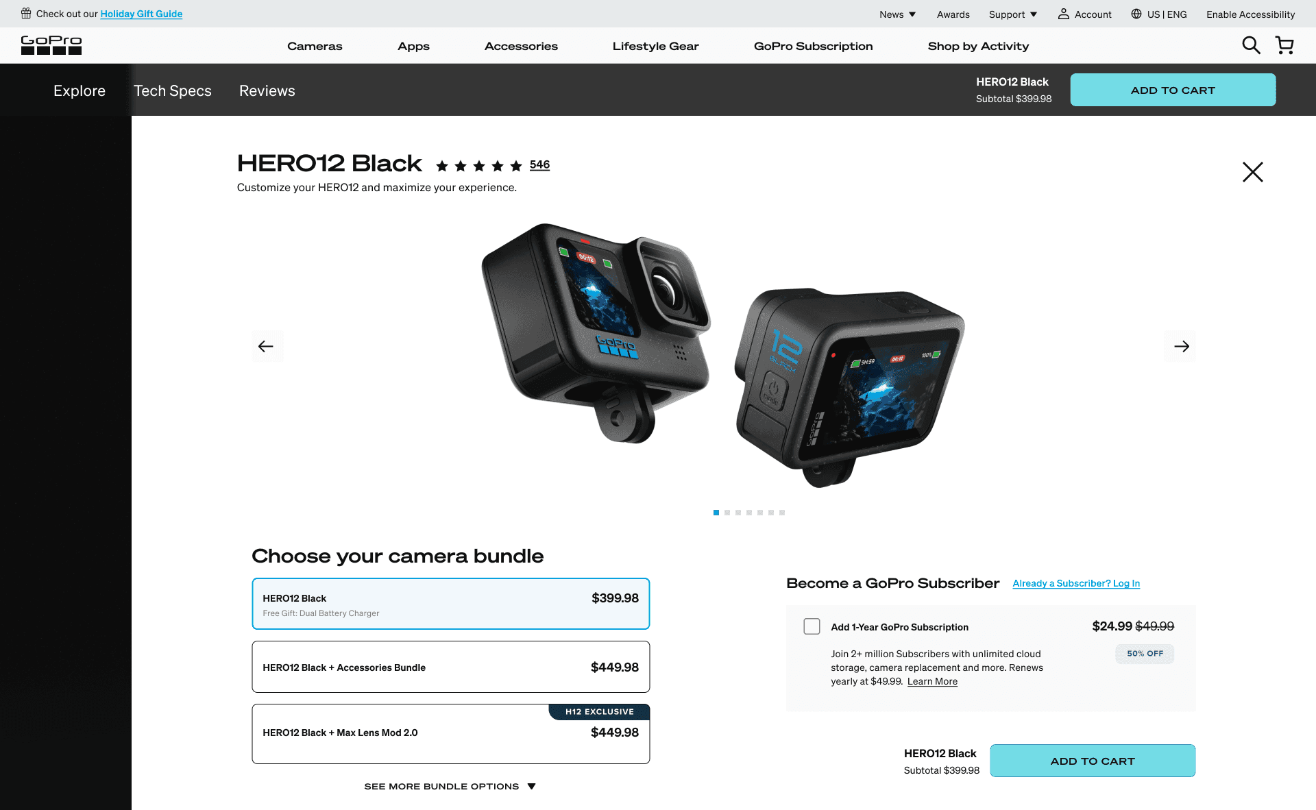
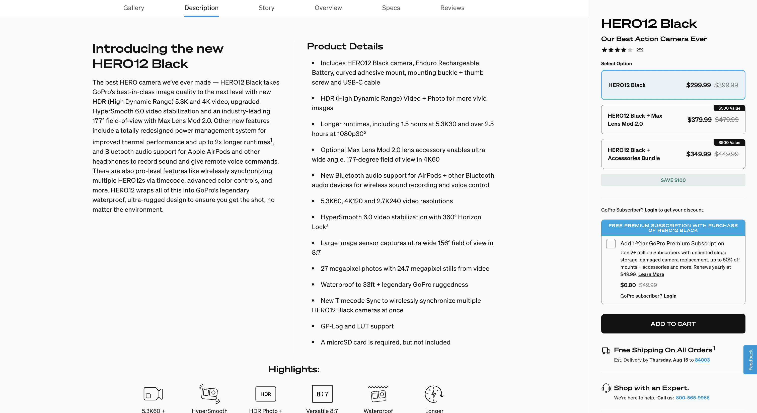
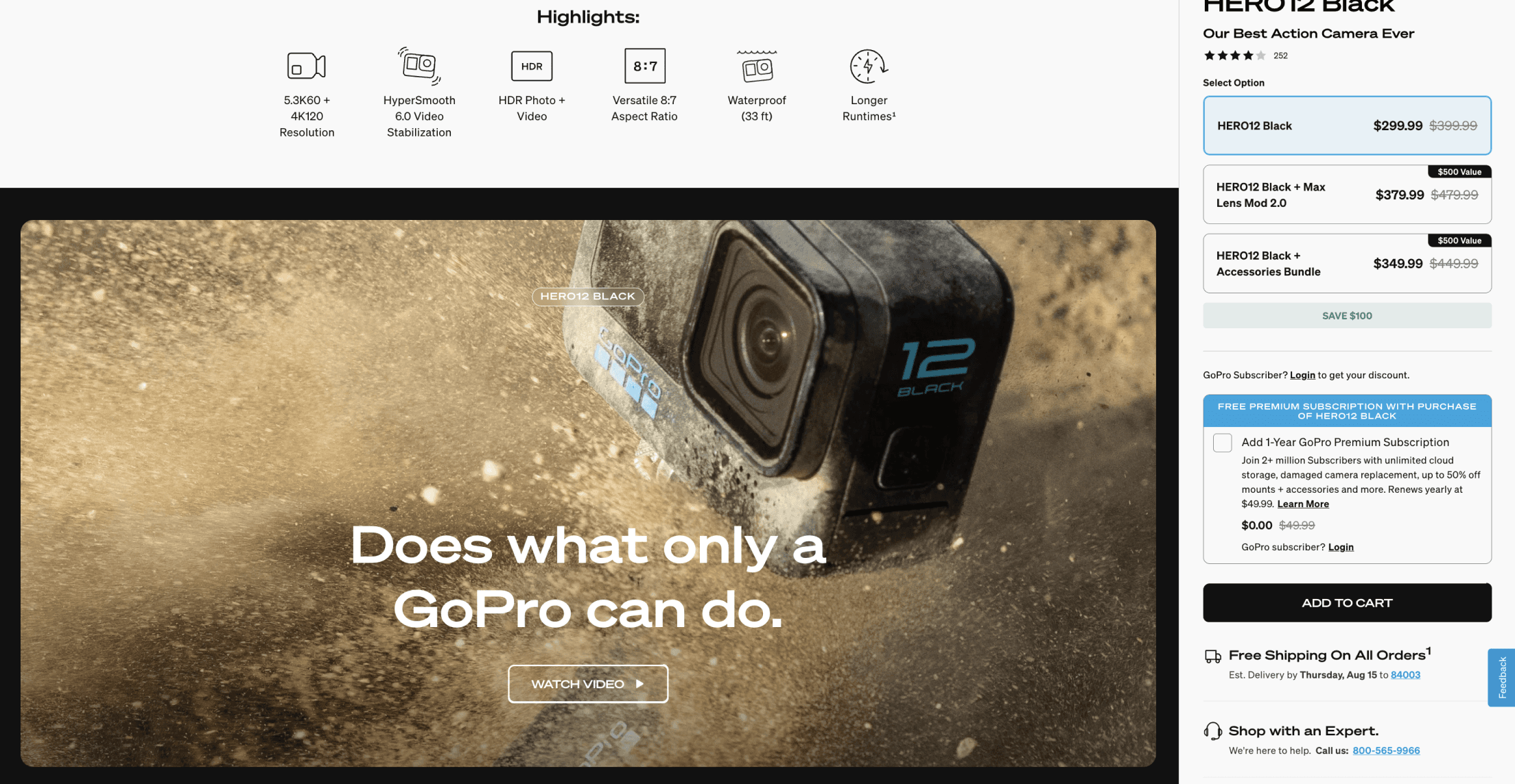
Overall, the left-right layout on the main “Buy” page—featuring a fixed left panel and scrollable sections for scalable options on the right—performed best in testing.
The most effective interstitial design clearly confirmed the item added to the cart and included a streamlined upsell recommendation, striking the right balance between clarity and persuasion.
Overall Winner
Overall, the left-right layout on the main “Buy” page—featuring a fixed left panel and scrollable sections for scalable options on the right—performed best in testing.
The most effective interstitial design clearly confirmed the item added to the cart and included a streamlined upsell recommendation, striking the right balance between clarity and persuasion.
01
Initial research
02
desk research
03
competitive audit
04
design iteration
05
impact evaluation
01
02
03
04
05
Pre-Launch Experiment
Pre-Launch Experiment
Pre-Launch Experiment
Larger Sample Size Validation, n=240
Larger Sample Size Validation, n=240
Larger Sample Size Validation, n=240
Goals
Goals
Goals
Evaluate the new UX against the existing design to identify areas of improvement, ensure an enhanced user experience, and uncover any potential usability issues that may have been overlooked.
Evaluate the new UX against the existing design to identify areas of improvement, ensure an enhanced user experience, and uncover any potential usability issues that may have been overlooked.
Evaluate the new UX against the existing design to identify areas of improvement, ensure an enhanced user experience, and uncover any potential usability issues that may have been overlooked.
Old Design
Old Design
Old Design
New Design

New Design
The same copy, imagery, and content order were used to reduce confounding factors** (Except for the HERO image in the current design)
The same copy, imagery, and content order were used to reduce confounding factors** (Except for the HERO image in the current design)
The same copy, imagery, and content order were used to reduce confounding factors** (Except for the HERO image in the current design)
Key Hypothesis
Key Hypothesis
Key Hypothesis
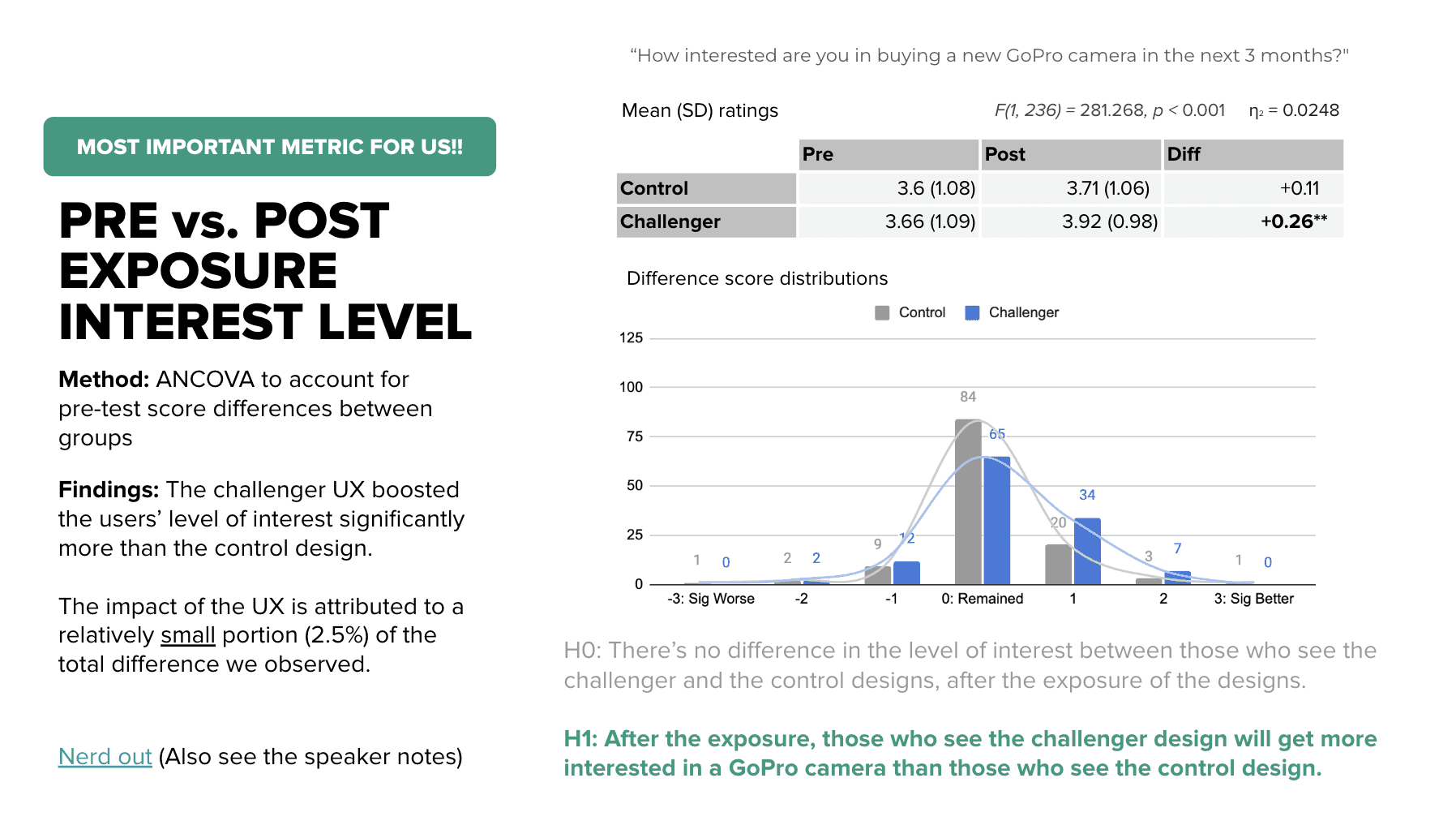
Hypothesis #1
After exposure, those who were assigned to the challenger design will show more interest in a GoPro camera than those who saw the control design.
Hypothesis #1
After exposure, those who were assigned to the challenger design will show more interest in a GoPro camera than those who saw the control design.
Hypothesis #1
After exposure, those who were assigned to the challenger design will show more interest in a GoPro camera than those who saw the control design.
Hypothesis #2
The challenger design is significantly easier to learn about the H12 camera than the control design.
Hypothesis #2
The challenger design is significantly easier to learn about the H12 camera than the control design.
Hypothesis #2
The challenger design is significantly easier to learn about the H12 camera than the control design.
Hypothesis #3
The challenger design leads to significantly favorable impressions of the website (e.g., easier to use, less confusing, more exciting etc.)
Hypothesis #3
The challenger design leads to significantly favorable impressions of the website (e.g., easier to use, less confusing, more exciting etc.)
Hypothesis #3
The challenger design leads to significantly favorable impressions of the website (e.g., easier to use, less confusing, more exciting etc.)
Findings
Findings
Findings
The key three hypotheses were supported.
The key three hypotheses were supported.
The challenger design led to:
Significantly higher interest level post-exposure
Significantly higher perceived learning effectiveness
Significantly better impressions
The key three hypotheses were supported. The challenger design led to:
Significantly higher interest level post-exposure
Significantly higher perceived learning effectiveness
Significantly better impressions
The challenger design led to:
Significantly higher interest level post-exposure
Significantly higher perceived learning effectiveness
Significantly better impressions
Through sentiment maps we then identified what worked well + what users expected improvement.
We also tweaked UX based on both pros + cons including UX writing
Through sentiment maps we then identified what worked well + what users expected improvement.
We also tweaked UX based on both pros + cons including UX writing
Through sentiment maps we then identified what worked well + what users expected improvement.
We also tweaked UX based on both pros + cons including UX writing
01
Initial research
02
desk research
03
competitive audit
04
design iteration
05
impact
Before and After
Before and After
Before and After
Overview of general structural changes
Overview of general structural changes
Overview of general structural changes
Before
Before
Before
Learn + Buy journeys are combined in one page.
Learn + Buy journeys are combined in one page.
Learn + Buy journeys are combined in one page.
A big block of text -- Over 80% drop out rate.
A big block of text -- Over 80% drop out rate.
A big block of text -- Over 80% drop out rate.

Learn
Learn
Learn
Learn
Buy

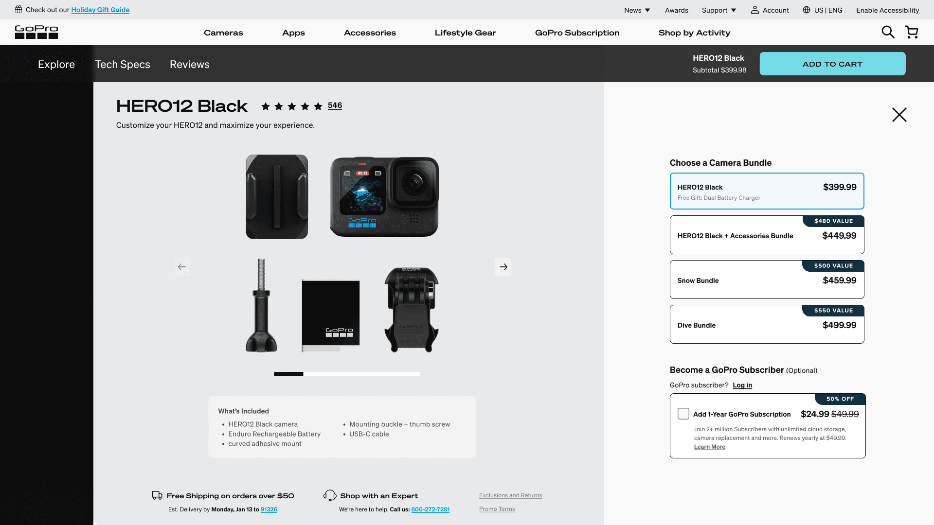
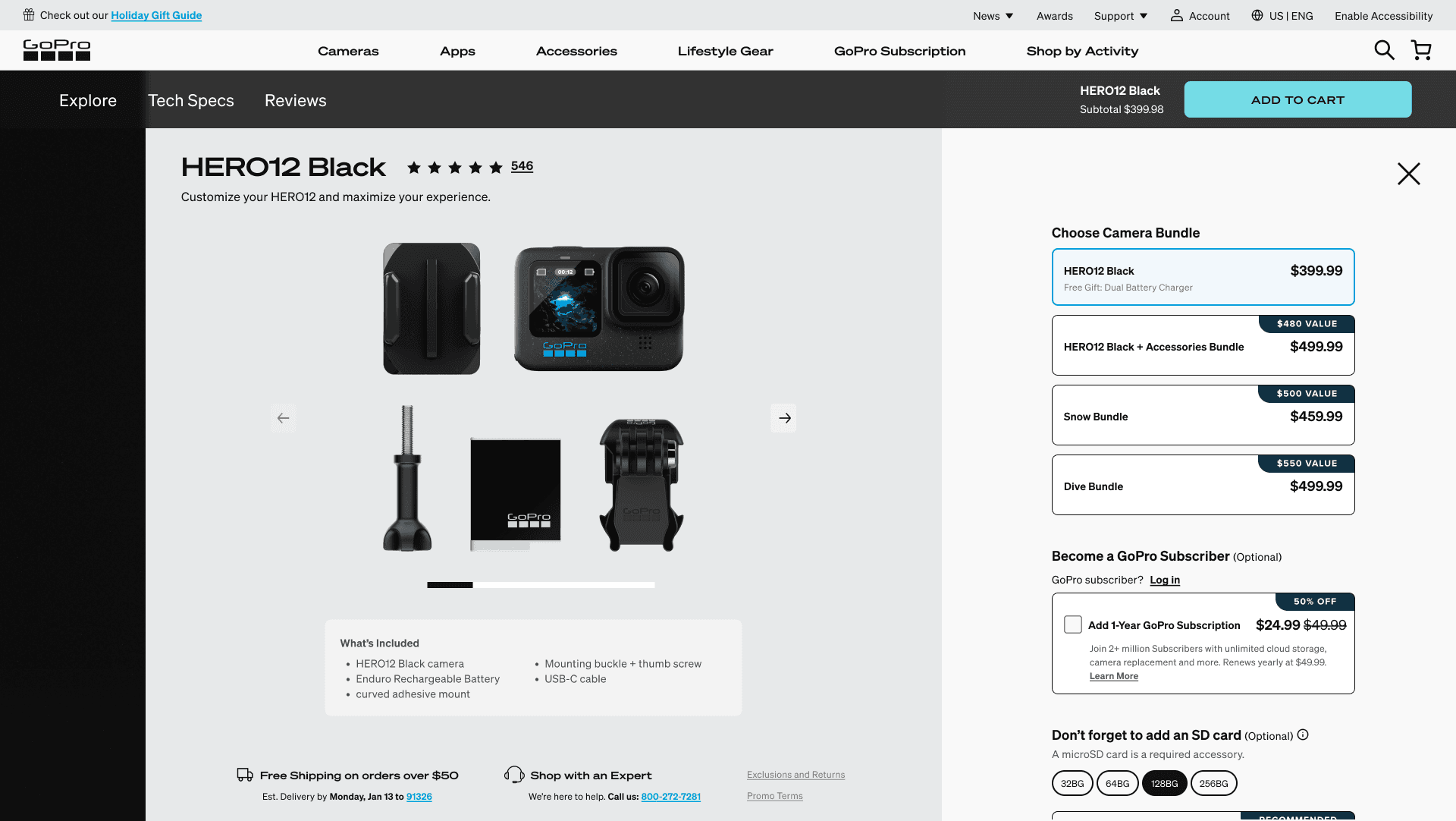
After
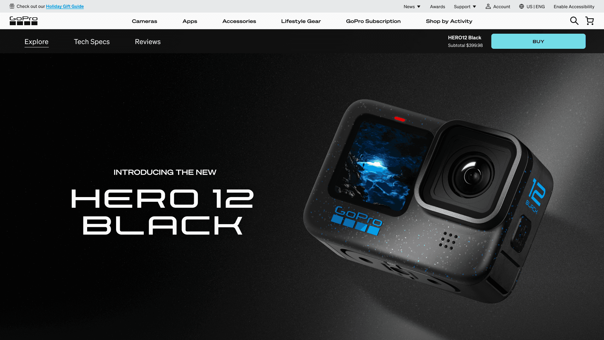
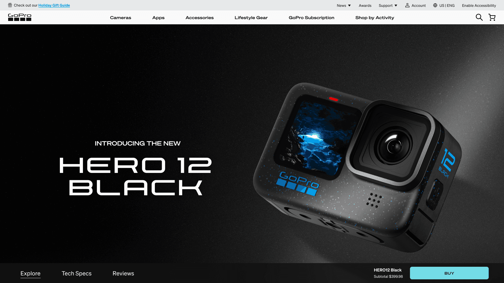
Separated Learn + buy journeys for a more focused user experience
Separated Learn + buy journeys for a more focused user experience
Separated Learn + buy journeys for a more focused user experience

Learn
Learn
Learn


Buy
Buy
Buy
01
02
03
04
05
01
Initial research
02
desk research
03
competitive audit
04
design iteration
05
impact
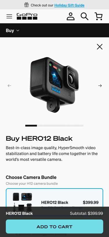
Before and After: Buy
Before and After: Buy
Before and After: Buy
Redesign summary for the buy page
Redesign summary for the buy page
Redesign summary for the buy page
Before
Core page requirements were taken from the original page and adapted in the redesign
Core page requirements were taken from the original page and adapted in the redesign
Core page requirements were taken from the original page and adapted in the redesign
After
Carefully considered content presentation
Carefully considered content presentation
Carefully considered content presentation


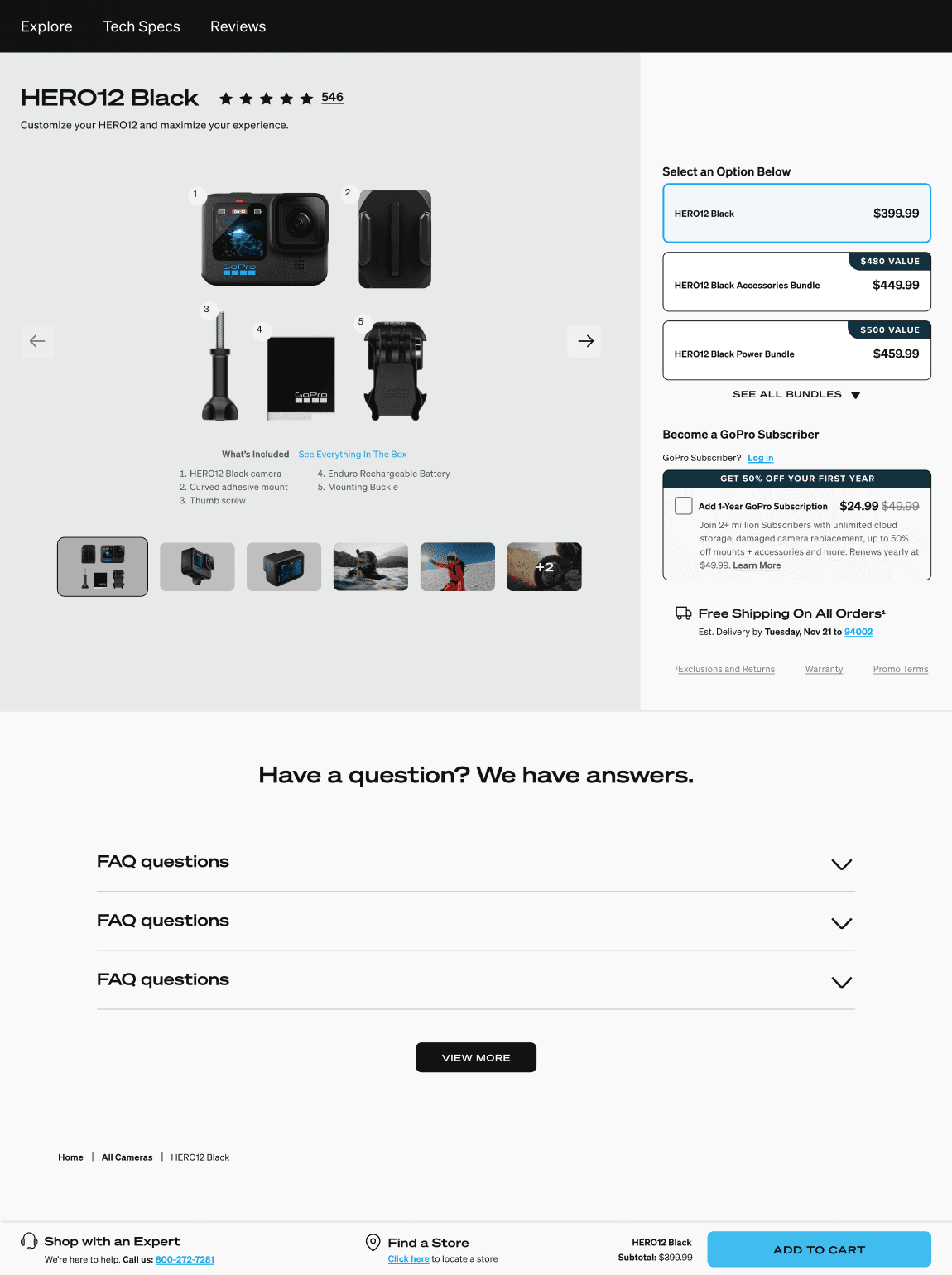
What’s included clearly visible
Collapsed bundle section for scalability
Subscription + Free shipping info above the fold
What’s included clearly visible
Collapsed bundle section for scalability
Subscription + Free shipping info above the fold

Mouse movement is also carefully considered.
(Top --> Bottom)
Mouse movement is also carefully considered.
(Top --> Bottom)
Mouse movement is also carefully considered.
(Top --> Bottom)
What’s included clearly visible
Collapsed bundle section for future scalability
What’s included clearly visible
Collapsed bundle section for future scalability
Subscription + Free shipping info above the fold
Subscription + Free shipping info above the fold
Mouse movement is also carefully considered.
(Top --> Bottom)
01
02
03
04
05
01
Initial research
02
desk research
03
competitive audit
04
design iteration
05
impact
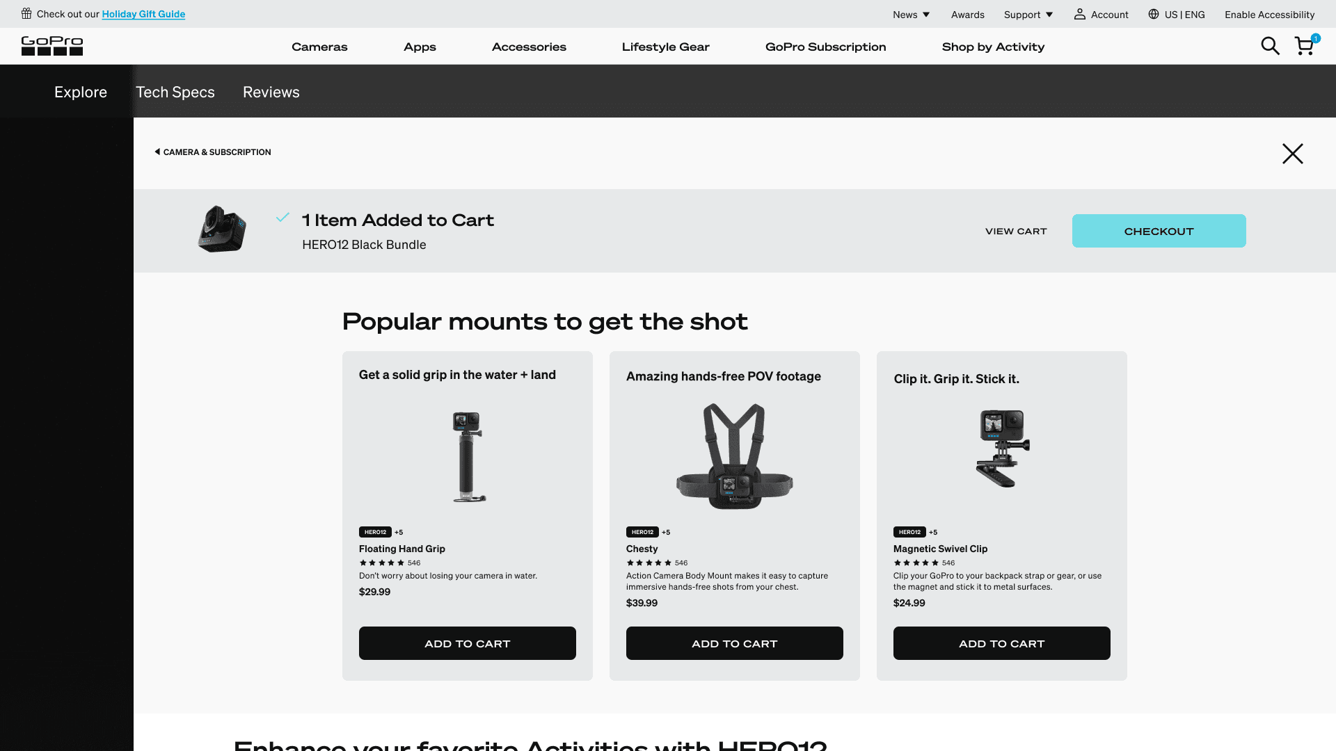
Before and After: Interstitial
Before and After: Interstitial
Before and After: Interstitial
Redesign summary for the interstitial page
Redesign summary for the interstitial page
Redesign summary for the interstitial page
Before
Before
Before
Small and crowded interstitial with upsell cut off below the fold at smaller breakpoints.
Small and crowded interstitial with upsell cut off below the fold at smaller breakpoints.
Small and crowded interstitial with upsell cut off below the fold at smaller breakpoints.

Nearly 0% conversion
Nearly 0% conversion
Nearly 0% conversion
After
Carefully considered content presentation
Carefully considered content presentation
Carefully considered content presentation

Key revenue booster items
Camera specific accessories
Key revenue booster items
Camera specific accessories
Key revenue booster items
Camera specific accessories
Use of color to highlight what’s added
Personalization via the Shop by Activity experience*
Personalization via the Shop by Activity experience*
Personalization via the Shop by Activity experience*
Camera specific accessories
Use of color to highlight what’s added
01
02
03
04
05
01
Initial research
02
desk research
03
competitive audit
04
design iteration
05
impact
Impact at a Glance
Impact at a Glance
Impact at a Glance
Looking at the post launch results
Looking at the post launch results
Looking at the post launch results
We lose 80% of traffic on the 8th module down the page
We lose 80% of traffic on the 8th module down the page
We lose 80% of traffic on the 8th module down the page
Checkout to Purchase:
Up 19%
Checkout to Purchase:
Up 19%
Checkout to Purchase:
Up 19%
PDP to Add to Cart:
Down 29%
PDP to Add to Cart:
Down 29%
PDP to Add to Cart:
Down 29%
Add to Cart to Checkout Starts:
Down 6%
Add to Cart to Checkout Starts:
Down 6%
Add to Cart to Checkout Starts:
Down 6%
Note: This was a huge improvement! We used to lose 80% of people before they get to the first content module.
Note: This was a huge improvement! We used to lose 80% of people before they get to the first content module.
Note: This was a huge improvement! We used to lose 80% of people before they get to the first content module.
Overall, our team deemed the project a success.
Overall, our team deemed the project a success.
Overall, our team deemed the project a success.
Our solution was less effective for unqualified traffic—visitors with little intent to purchase—but performed well for qualified traffic—those serious about buying. The introduction of the "Learn" page added a step in the user flow, which deterred unqualified visitors. However, for qualified visitors, this additional content increased their likelihood to purchase.
It also set the stage for our next step: How might we drive more traffic to the Buy page?
What’s Next?
Our team wanted to keep the redesign, but improve the traffic to the Buy page.
We started to define the areas of improvement, and brainstorm "How might wes" to get us going on designs.
How might we...
Drive more traffic to the Buy page from other pages of the website?
Drive more traffic to the Buy page from the Learn page?
Bring more attention to the Buy button on the Learn page?
Currently different designs are being reviewed and tested to address these areas of improvement.
01
02
03
04
05
Solution
We separated the "Learn" and "Buy" journeys into distinct pages, allowing users to focus on either exploring camera features or purchasing options.
This focused approach reduced user friction and increased engagement.
Results:
19% increase in checkout rate from the Product Details page.
Enhanced user engagement through streamlined content and navigation.
Check it out in the wild